
MATERIALS
• Half sheet of ‘pinkish’ pastel paper with a smooth surface.
• Six shades of Caput Mortuum pastels.
• Caput Mortuum pencil.
• Pastels in Blue and Lamp Black.
• Newspaper photograph.
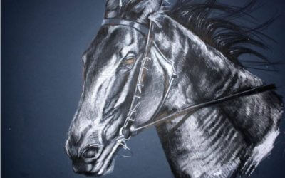
There are times when something hits me in the eye and I know I have to draw it. The moment I saw this man’s face in a newspaper, I knew I had to have a go! As I am now a confirmed user of pastels, I decided to approach the painting from a different angle. I always seem to have difficulty using the method of measuring the different lengths and spaces required, so this time I used the grid method.
For a change, I used one colour (mainly) with just a touch of black in the eyes. The colour I chose was Caput Mortuum. I had never heard of this colour until I attended a two-day workshop a few years ago. Initially I decided to make the eyes blue … but (as you can see) towards the end I realised that they stood out too much and I reverted back to the Caput Mortuum shading.
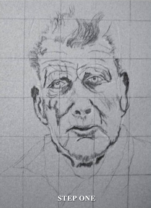
STEP ONE
Using the smooth side of half a sheet of pastel paper, I drew grid lines and did a fairly rough copy of the outline of the head, eyes, nose, mouth and ears. This was done using a Caput Mortuum pencil and a T554 pastel. I stood back to evaluate the positioning.
STEP TWO
Next, I tinted some of the skin area with V554. I did a bit of blending to make the skin appear smooth. The eyes were then filled with Lamp Black.
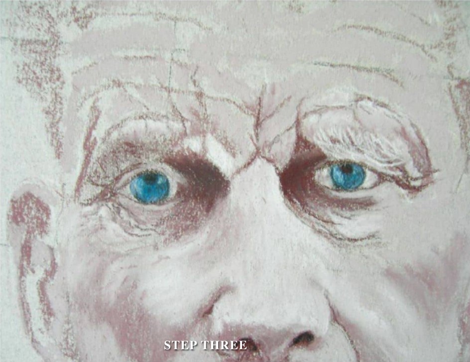
STEP THREE
I added age lines and started on the hair to get the general outline. I then concentrated on the eyes, and decided to make them blue! They certainly stood out. Next, I built up more area around the eyes and did some more blending.
STEP FOUR
I like to move around a painting; not always finishing one area before moving on to another. I decided to put some shading in the background to bring the features forward. I did quite a bit of blending here, using P554. I also used V554 and X554 to build up the hair.
At this stage I needed a break – so I put the painting away for a week.
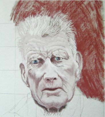
STEP FIVE
The break was a good idea. It enabled me to look at the work through new eyes. I decided to concentrate on finishing the background and the clothing. I also worked on the neck area, which seemed too dark. After another evaluation, I felt that the eyes just stood out too much – so the blue was removed. Back to black. I then built the eyes up with Caput Mortuum shades.
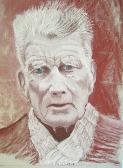
FINAL STEP
I signed the painting and then left it alone. It can be easy to keep tweaking and fiddling. Knowing when to stop is the hardest thing, sometimes. I don’t often use fixative; I prefer to roll my painting with a rolling pin, placing tracing paper over the top (this helps to fix the pastel).

MASTER HINTS AND TIPS
• If something grabs you, paint it!
• Use good quality paper.
• Work out the composition of your scene.
• Good quality pastels are important; along with a selection of pastel pencils.
• Join an art group to share experiences and knowledge.
• Most of all, enjoy every moment … even the frustrating ones.