
MATERIALS
• Red Canson Mi-Teintes paper.
• Steel outdoor easel (Italian made) – heavy enough to be stable and easy to carry and set up.
• Tripod table: An adapted cheap plastic tray which can be screwed onto a camera tripod.
• Pastels.
• Fixative spray.
• Drinking water, hat, sunscreen, a small tarpaulin for shade; and (sometimes) a painting dog for company.
THE PASTELS
I keep my ‘outdoor’ set in a cheap plastic fisherman’s box – the kind with compartments used to keep hooks and lures. I pack the pastels in with cotton wool or rice, so the rougher the journey, the cleaner they get. I use all kinds from the softest Unison, Schmincke, Sennelier, Art Spectrum, Winsor & Newton, to the relatively hard Rembrandt, Conte sticks and pastel pencils, and now the American Pan Pastels. The more colours the better. I never have enough. In this painting I used a wide range of colours, hardnesses and makes of pastels – but the indispensable ones were: Art Spectrum Flinders Red Violet and Flinders Blue Violet; Schmincke Dark Green and Grey Green; Red, Green, Purple and Black Pan Pastels, Rembrandt, W&N and Unison Grey-Pinks, Grey Mauves, Reds and Oranges; Pan Pastel and Unison White, Light Greens, Warm Yellows, Oranges and Warm Blues.
I paint most of my pastels en plein air – it must be my English background. If it’s daylight and not too cold, I want to be outside painting; with binoculars handy in case any interesting birds are around. While painting this work, I was joined by a family of Red-tailed Black Cockatoos. These magnificent birds were feeding on the native Terminalia and Canarium nuts, with a baby crooning monotonously from a leafy tree nearby.
For this painting I used the smoother side of red Canson Mi-Teintes paper This paper is inexpensive and readily available, so I don’t mind using a lot of it, however it has its limitations. It can only take so much pastel before the surface starts breaking up. I chose red because I like to let the paper shine through in some places – it creates warmth and I did not want dull black shadows. I used only a half sheet to be sure of completing the work.
STEP ONE
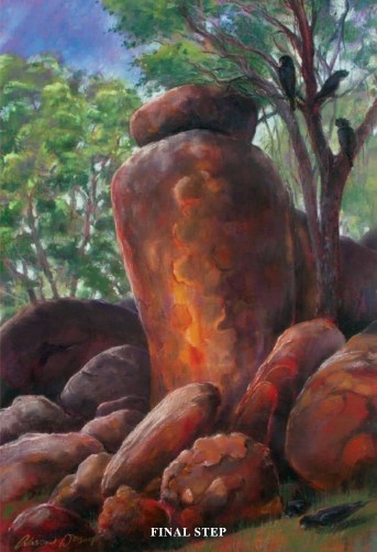
I need to be inspired by my subject matter. Coming from industrialised, crowded Europe, tropical northern Australia is still full of unexpected beauty and surprises. Any short walk in the bush provides inspiration. This group of rocks in the Mary River National Park (proposed) is one of many – but the peculiar upright stone capped with another boulder has a special, commanding presence.
Having selected my subject, I explored it from several angles and pragmatically looked for a viewpoint that provided the artist with some shade. I hitched my tarpaulin under a small rock fig tree.


STEP TWO
I carry a small sketchbook in which I try out several very quick tonal drawings to establish light, shade and alternative compositions. I realised I had to capture and emphasise the morning sun to make the tonal values interesting.

STEP THREE
Grace Paleg introduced me to the idea of applying pastel directly on the paper with one’s hands – and the new Pan Pastels are ideal for this, even if this method is not recommended by the manufacturer. I established basic tones, composition and shapes using black and white Pans, applied with the heel and side of my hand to create dry washes and subtle marks that were easy to change or paint over as the painting developed.

STEP FOUR
At this stage I established the full intensity of the dark tones, using dry washes of green, purple and red Pan Pastels, and to define the darkest areas, the Flinders Red Violet and Flinders Blue Violet for the cooler areas. I continued to block in and develop all areas of the painting, starting with the sky and working downwards.

STEP FIVE
I worked on the painting as a whole, not spending too long bringing any one area ahead of the others. Intensifying the colours, defining edges, forms, structure and detail of the rocks and trees; working dark to light.
All the colours in the Northern Territory seem to be ‘warm’so to bring the foreground into perspective, I needed to exaggerate the redness and warmth of the bare soil and also keep the shadows ‘warm’ using the Art Spectrum Flinders Red Violet.
I spray fixed at least once in this stage, also keeping an eye on the paper surface (it can only take so much pastel before it begins to deteriorate).
STEP SIX
I had spent about two hours at the scene and couldn’t stay much longer. It was time to take a last objective look to check a few important things: Had I captured the essence of the scene? Did the rocks look solid and rocky? Had I made the reflective surfaces of the rocks light enough? Was the atmospheric perspective right, with softer shapes and cooler colours receding into the background?
I made the trees behind the rocks greyer and cooler by putting mauves next to the brilliant greens, while keeping the foliage delicate and translucent.
Was the aerial perspective right, with the shadows flat on the ground? Were the shadows consistent with a light source from the east? It was now nearly midday, and the sun was actually overhead. It was time to spray fixative, pack up and go home.

FINAL STEP
With the work in my studio, I spent a long time (days) looking and making minor adjustments. In particular, I needed to raise the tonal values – colours that looked fine in the open air needed to be lightened and brightened to glow and look good inside.
Finally, I decided those black Cockies really did need to be recorded. This was their place’. They added life and interest … and a memory, for me, of their company.

REFLECTIONS
I often feel quite pleased with a work just after I have finished it. The self-critical and objective assessment comes later, when I have moved on and disengaged from the work. Looking back on this piece, I am inclined to think that Step 5 had a semi-abstract quality and freshness that was lost in the finished version. Should I have stopped earlier? Could I have developed a beautiful paint surface without going into so much detail?
Well, there is always next time.