For this demonstration, I chose to paint a scene of the Goulburn River, Seymour. Water is one of my favourite subjects. I obtained the reference material on a warm summer evening just as the sun was going down, and the mosquitoes were coming out! I took some reference photographs, and then sat beside the river and made a few small sketches with my pastels mainly to establish what colours I would use (working very quickly before the light disappeared).
In the studio I attached a sheet of burgundy Colourfix paper (made by Art Spectrum) to my easel. I also attached a sheet of paper towel to the board beside my paper (this was helpful to give the pastels a quick swipe to clean them as I worked).
I have a wide range of pastels. For this piece I used Art Spectrum, Schminke, Lukas, Unison, and a couple of my own ‘hand-made’ pastels (leftover pastel pieces crushed to a powder with a pestle and mortar, with a small amount of water added, rolled into a pastel shape, placed in foil and put in the oven to dry – see Insight article).
STEP ONE
I did a minimal drawing with a light blue pastel pencil to establish the overall composition; and the line of the river bank and placement of trees.

STEP TWO
I very loosely applied the sky colours using cool blue tones at the top, medium blue tones in the centre and warmer pinks towards the horizon. I tend to think about “warm and cool colours, rather than ‘light and dark”. I worked from the top to the bottom of my painting to avoid smudging.

STEP THREE
The sky colours were blended together using the side of my hand, and fingers. I added a bit more pastel where necessary to get a smooth underpainting.
STEP FOUR
I began to block in the trees using a range of blues, greens, a warm burgundy, a red, a warm apricot, and a couple of yellows and golds. I also began to add the darkest tones to the river.

STEP FIVE
I started to block in the closer trees and added some of the trunks and branches.
STEP SIX
I repeated the darkest tree colours and a splash of the sky colour to the river, and lightened up the trees that were further away (to add some depth) by scumbling a cool lilac colour over the top. I felt that this was roughly the halfway mark, so I gave a light spray with a pastel fixative to prevent the underpainting from smudging.

STEP SEVEN
I was really beginning to enjoy myself at this stage! I established the bright golden highlighted part of the painting where the sun was hitting the river bank (which attracted me to this scene in the first instance). I added more golden highlights to the trees and to the reflections in the river. I also worked on the tree trunks and branches, using warm colours against the dark areas and cool colours against the light areas to give the impression of how the evening light was hitting the trees.

STEP EIGHT
I continued to work on establishing the contrast between the foreground trees and the background trees by adding some lighter colours where necessary. I really began to enjoy smudging and blending at this stage. I also did more work on the water and reflections, adding layers of colour – working from dark to light. A quick light spray of fixative enabled me to continue with layers without smudging the underlying colours. The lilac Unison pastel worked really well (I love the texture of this brand of pastel) and I scumbled it gently over the tops of the trees and also into the water to lighten up areas over the darker blues. I added skyholes to the trees where I thought they needed to be thinned out a bit.

STEP NINE
I worked on the closer reflections and added highlights to the water. I livened up some of the darker areas, by adding some warm reds. I added squiggles of sky colour over the dark foreground water to give the feeling of movement. I also added more warm colours to the lighter area of water.
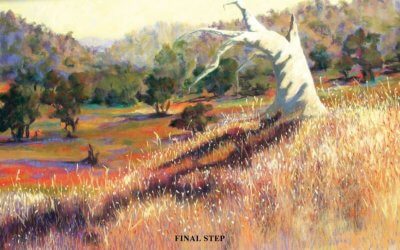
FINAL STEP
Not far to go now! I worked on refining some of the reflections using the side of the pastel to create lines in the water, and also squiggles to create a feeling of movement. I added a few gum leaf saplings to contrast against the light water, and a few darker colours at bottom left corner to create a nonintrusive impression of the left bank. I added some more warm pink tones to the sky and some more warm reds to the darker water; and I left some areas unblended to create texture.

ARTIST’S HINTS AND TIPS
• Don’t be too “precious’ about your pastels. Remove the wrappers, they get in the way. Don’t be afraid to break them into smaller pieces if that makes them easier to work with. Breakages also provide some nice sharp edges useful for details.
• Fresh white bread squished into a ball works really well as an eraser, and doesn’t affect the paper surface – especially good for papers such as Canson; whereas the sanded surfaces such as Colourfix can take more punishment and a putty eraser will work fine.
• Make a chart when buying new pastels, by putting a sample of the colours onto a sheet of pastel paper; and write the brand, colour name and reference number beside each colour. This is invaluable when you want to obtain replacements.
• Work from dark to light. Have a damp cloth handy for wiping your hands, as pastels are quite messy to work with.
• Have a piece of carpet underneath your easel so that if you drop a pastel it won’t smash to smithereens!
• I never use black or white pastels, as I find the effect too harsh. I prefer to make my ‘darks’ from warm earthy colours, such as burgundy or dark red mixed with dark blue. There is also an endless range of light pastels to use, without needing to use white. For the same reasons I don’t use black or white pastel paper – preferring to use Burgundy or Terracotta Colourfix.
• Harder pastels work well for “underpainting’. Keep the softer ones for finishing touches and highlights.
• Keep fixative spray to a minimum, as I have found it can change the colours slightly. I use it very sparingly a couple of times during a painting, with a very light spray at the end.