
MATERIALS
• Large, upright easel
• Large backing board either in masonite or any nonpliable board with a smooth surface (size 1m x 1.1m)
• Strong bulldog clips – taping the inside of the clip that holds the paper to the board helps to prevent indent marks on the works
• Arches 300gsm or Saunders Waterford 300gsm paper are my favourites for smaller works in pastel or a roll of paper I cut to size for larger works. The paper must have a good ‘tooth’ or roughness to allow the charcoal and subsequently pastel to grab.
• Selection of soft charcoal sticks in various sizes, i.e. thin sticks for details and thick sticks to cover larger areas
• Soft, medium and hard charcoals for a stronger attack on the paper
• Kneadable rubber to lighten areas or take off excess charcoal or pastel
• Sennelier, Schminke and Rembrandt are my favourite pastel brands but I’ll grab anything that captures the pigment I’m after.
• Fixative
• Permanent fixative
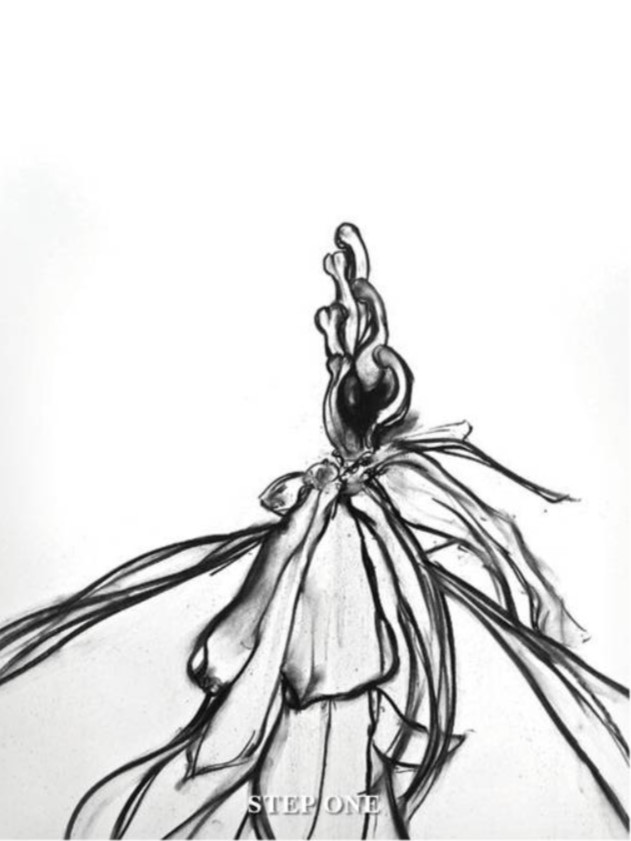
STEP ONE
To begin a work, I always use a soft thin charcoal stick. Quite a few. This is good for shading and structuring the composition. I also use my hands and fingers to help shape the forms of the work. I love to get my hands dirty and feel the paper directly. At this stage, I work the tonal gradations of the image i.e. light and dark areas. Charcoal is good for re-working areas until I’m satisfied with the overall design. A kneadable rubber comes in handy to remove excess charcoal or to lighten areas.
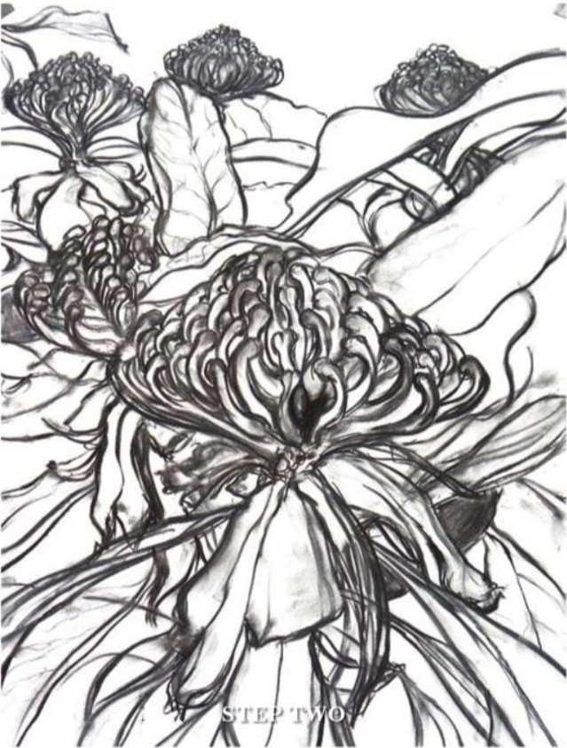
STEP TWO
Blow off any loose charcoal and lightly spray with workable fixative or hairspray to prevent the charcoal from blending into your pastels too much. Next comes the exciting part. The introduction of colour changes the work and delineates a flurry of lines into a recognisable image. Because I’ve chosen an Australian native waratah for my artwork, the dominant colours are red and green. I like to jump in with the main focus of the flower first and begin with red. Group together all red pastels from light, mid, to dark tones.
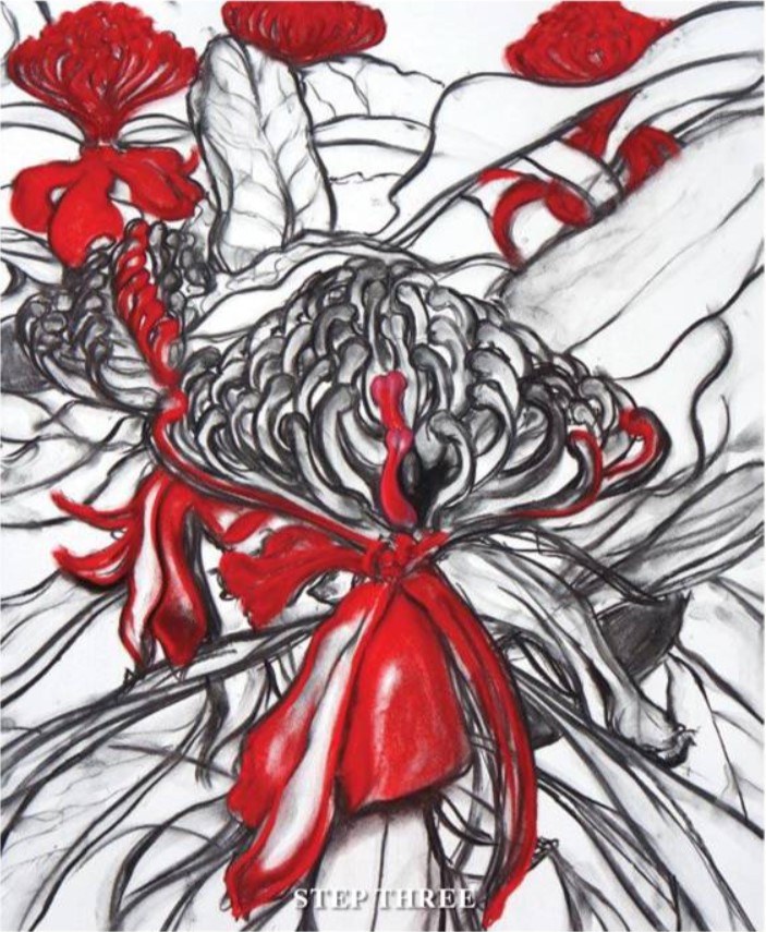
STEP THREE
Use a couple of baby wipes to clean your hands so pigments don’t become muddy. Try to use these continually between different colour applications. I begin with a darker red and blend into the blacker areas and create shadows. I leave the lightest areas white. I also use a black pastel for shadows and some outlines as this creates a stronger contrast with the colours. I fill all the red parts at this time.
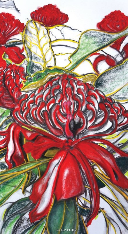
STEP FOUR
Next, I bring in the greens and the veins of the leaves using a lighter green and yellow. I apply the pastel on its side to cover large sections, and then blend with my fingers to soften and shade. Make sure all white background areas are covered and you blend right to the edge of the paper. This is where you have fun with the interplay and dance of the greens and reds. You can use a blending stick to combine the colours, but I find this tends to lift a lot of the pastel. Once the paper is completely covered, spray to fix with a workable fixative. The work will darken. Don’t be alarmed. Pastel is about layering Each layer needs to be fixed before the next application can occur.
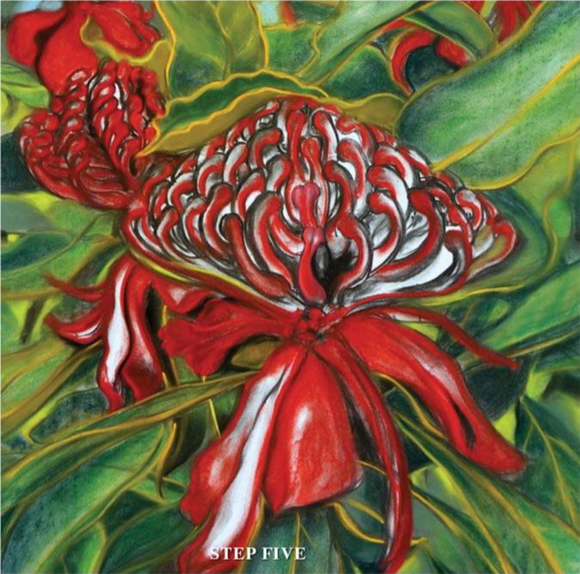
STEP FIVE
Now I start to detail with the softest pastels i.e. Schminke, to enhance the lighter parts such as the veins and outlines of the leaves and highlighting the flowers. If you use hard pastels at this stage, you risk scratching the image. The soft pastels blend easily into the paper and give a final, intense pigment. The detailing tightens the image and helps create depth.
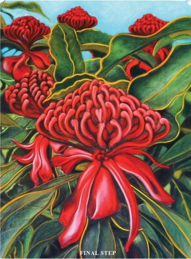
FINAL STEP
Spray once more lightly to fix. The artwork will darken again each time you spray, so do it lightly. I then do my final highlighting touch ups and spray with a proper fixative, not a workable one.

ARTIST’S HINTS AND TIPS
• Choose a subject matter that inspires you. I can be inspired by many things. Nature, people, poetry, my surroundings, world events. The simple, exquisite beauty of flowers has drawn me back many times, and really showcases the intense pigments of pastels.
• Photographing your own subject matter is great, and the Internet presents a wonderful resource tool.
• Be careful of composition. Sometimes I refer to a number of images and references and compose the work as I go. Other times I work from photographs I have taken. A bad photograph can make an even worse artwork if you choose to use it for inspiration.
• Always stand at your easel. This allows you to fully engage with the work and also to pull back and observe the image from a distance. A good artwork translates well from close up and from afar.
• Use a hand protection cream before you start to create a barrier from the charcoal and pastels. I use Tough Hands or Hand Shield (liquid gloves).
• Also have Baby Wipes nearby for your hands. Use these periodically to freshen your hands and in between different colour pastel applications.
• Sometimes I like to leave a work for a while and come back to it after a couple of weeks. This allows a fresh perspective before signing off.
• Because I work the image right to the edge of the paper, I like to leave a good distance between the artwork and the frame. Never frame directly against the work as this crowds and suffocates the image. I love the look of the artwork floating in the frame.
• I have a large collection of pastels sorted into boxes and trays of greens, yellow, reds, blues, browns, creams, whites etc. I tend to reach for the pigment that best serves the work. The softest pastels are the ones I leave for detailing such as Schminke and Sennelier. I can’t tell you specific colour names as I rip off the labels immediately to see the pigment. I’m drawn to the hues.
• Fixative is an important part of pastel work. In essence, you are working with compressed, coloured dust. As you work each layer, a light spray binds the pastel to the paper and creates the ‘tooth’ for the next layer. In these early layers, I sometimes use hairspray. It’s a lacquer after all. Or I use a workable fixative.
• Permanent fixative (use a light spray to bind the pastel once the work is completed)