MATERIALS
• Full sheet of Colour-fix paper, ‘masking taped’ to a board.
• Hard pastels.
• Soft pastels.
• Methylated spirits.
• Bristle brush.
• Rags.
• Charcoal pencil and pastel pencils for finishing
I have been experimenting with a process where hard pastel is pushed into the paper with methylated spirits, and then the work is finished with pastel when that surface is dry. It is a fun process, as well as being one where the results can be visually exciting.
When beginning the work, I find it is best to break down the composition into broad areas of colour, which discourages me from becoming absorbed in fiddly bits and fussy attention.
Also, the base of my composition is applied using the opposite colour (on the colour wheel) to what will be the ‘end colour of the subject. This results in splashes and hints of what I call Zing and Zang’!
STEP ONE
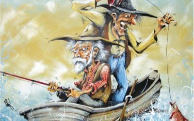
I set the pose on the paper, using hard pastels, reducing the work to broad areas of solid colour. For this picture, I selected blue for the skin, orange for the hair and red for the shirt; with blue and hot pink in the background. The pastel was not brushed off – I left the extra pastel shavings on the work for the next step. The first step was done with the work lying flat on a table (not vertical on an easel).

STEP TWO
Using a bristle brush (as used for oil painting), I pushed the pastel into the paper with methylated spirits – being sure to clean the brush between colours. I then allowed the work to dry.

STEP THREE
Using soft pastels, I began to search for the lightest and darkest tones.

STEP FOUR
I continued to add soft pastel, being as accurate as possible with the areas of tone.

STEP FIVE
I tried to work for as long as possible in broad areas of tone, to allow a more accurate representation to emerge. I love line; but a line in the wrong place can be distracting (particularly in the early stages of a work). I can be more forgiving of a larger tonal area being ‘not quite right’ until I discover the perfect place for placement of the final lines.

STEP SIX
At this exciting point, the character I was depicting began to talk to me! I used cross-hatched lines in the background to emphasise the difference between the skin treatment and surrounding colours.


FINAL STEP
I kept the lightest lights and darkest darks around the face, and deliberately understated the arms and shirt to maintain a focus on the face. I ‘greyed the red shirt and continued to refine the face – to complete my portrait of ‘Slim’. The detail in the face clearly shows how the underpainting adds excitement and vibrancy to the work.

MASTER HINTS AND TIPS
• Always use artist quality materials – we want pure pigment!
• Stick to bright solid colours for the underpainting.
• Tape your paper to a board for stability during the process, rather than using clips.
• Keep two jars of methylated spirits handy – one with clean metho for the painting, and one for the used metho (for cleaning off your brush).