MATERIALS
• Black cotton rag board 100 x 80cm
• White Colorfix primer
• 1/2″ flat brush for applying the Colorfix
• Schmincke Aero Colour Acrylic Ink in Primary Yellow and Burnt Sienna
• Pastels – I use many different brands and prefer a range of hardness so that my strokes appear different in different areas of the painting. The following are a few of my favourite types: Rusty tone pastels, (particularly the Pamela Pretty set which has my favourite colours) – Terry Ludwig pastels – Schmincke pastels – Art Spectrum pastels, especially the dark shades – Conte pastels
STEP ONE
My first image shows the initial drawing in pink Conte pastel, which is kept very simple. The light areas are then underpainted with mixtures of white Colorfix primer which have been tinted with Burnt Sienna and Primary Yellow acrylic inks. This is to create a warm, light textured area for the sky and sky reflection.
Underpainting these areas makes it much easier to create a glowing effect as I am underpinning my pastel layers with strong, warm, light colours.

STEP TWO
Working out from the underpainting, I keep the pastel layers thin and harmonious. A simple warm/cool colour palette is used initially. I am trying to lay down more colour than I need at this stage to give the painting life that will shine through from underneath. My intention is to layer over the top with more neutral colours later in the painting process.

STEP THREE
At this stage, all the undercolours are in place, and the structure is taking shape. The pastel is applied more broadly in these earlier layers. The painting still needs several more layers and detailing, but is beginning to be recognisable.

STEP FOUR
Most key areas have been refined now with an extra layer. The sky particularly has been layered with more neutral colours to allow the remaining high chroma and high key areas to sing. The tonal balance between sky and tree was established, and the far bank of the river was pushed back with layers of receding colours.

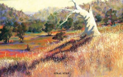
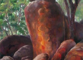
FINAL STEP
The final detailing is done with the addition of the rock on the riverbank and the twigs in the water. The trees are worked on more, giving attention to the light falling in the correct places. Finally, the sky is balanced with a little more grey worked into some of the blue to take the eye to the focal point.

ARTIST’S HINTS AND TIPS
• Look for dynamic shapes to give the painting a strong structure.
• In the same way, look at the negative shapes that you are making as they create a vital part of the design.
• Use mark making in pastel to reflect different areas and attributes you are trying to convey. Experiment with making different marks.
• Try using Conte pastels to modify areas of soft pastel. They can be hatched over an area or an edge to create some wonderful subtleties. I often use them in skies or clouds to create interesting overlays and to soften edges.
• If you are taking reference photos, try to make some observations to use later. Colour sketches and written notes are especially useful.
• Take every opportunity to paint en plein air to hone your skills. Outdoor painting improves many aspects of painting if you persevere with it. It is also a great way to see the world, meet other artists and have adventures!