MATERIALS
• Mt Gambier Blue Lake Paper
(“Brolga’ hand-made, 600gsm).
• Van Gogh oil pastels: Black 700.5; Prussian Blue 508.5; Blue Violet 548.5; Fir Green 654.5; Sap Green 623.5; Permanent Green 614.5; Greenish Yellow 243.5; Scarlet 334.5; Vermilion 311.5; Light Orange 236.5; Raw Sienna 234.5; Raw Umber 408.5; Light Orange 236.9; White 100.5.
STEP ONE
I began by drawing up the composition. Having established a composition (using Adobe Photoshop to manipulate photographs), I then sketched a basic outline using a broad grid.

STEP TWO
The next phase was the general mapping of areas of colour. The first layer of oil pastels was laid down using colours close to the actual colours of items; mapping in general areas and adjusting the composition as necessary. I used complementary colours together with purple and black to mark in darker areas so the composition lines and details of the drawing were not lost.

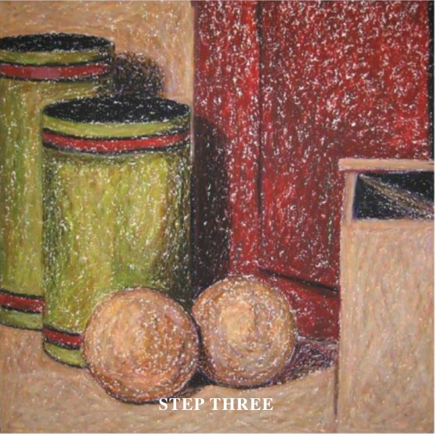
STEP THREE
A range of colours, particularly complementary colours, were laid down; then colours that approximated actual colours of objects (I will refer to them as base colours) were layered on top. Paler, more neutral areas became more coloured and darker in order to build up the oil pastel more heavily. At this stage the surface of the drawings had not yet become a solid layer. The work was then left to dry; and the process was repeated to further build the surface of the work. When dry, cream was used on lighter areas to introduce some tonal definition. An additional emphasis in this step was to develop an understanding of colour and the ways in which shadows and light fell within the composition.
STEP FOUR
A range of colours – base colours plus complementary colours – were laid on again at this stage, for the development of texture, depth and interest … with a focus on beginning to develop the interest in colour, depth and texture in the work. Cream and black were then used to increase definition. The work was left to dry once again; and then the process was repeated to build further texture and colour.

STEP FIVE
Here I attended to the merging of underlying pastels into the first solid layer. It was not until this step that the first solid layer was completed. I laid on cream and a minimal repetition of colours where necessary and then developed the first solid layer, trying to achieve a reasonable tonal likeness. Two or three different oil pastels (different tones of similar colours) were used in each area as ‘blenders’ to bring together the preliminary layers. At this stage tonal likeness was more important than achieving the desired colours.

STEP SIX
Base colours and complementary colours were once again laid down quite heavily. Tonal difference and definition were increased at this stage by using black and cream pastels, before a second solid layer was completed.

STEP SEVEN
By this stage, all areas had a solid build-up of oil pastels. Black and cream were then used to achieve greater tonal likeness, before all areas were worked over to achieve the desired colours. In doing so, I continued to use complementary colours before final colours were used. At this stage I paid closer attention to the detail in each object and to differences in colour and tone, adding interest and realism. There was also an increased focus on the relationships between objects, comparing colour and tone – particularly in areas where objects came together.

FINAL STEP
In the final stage I moved backwards and forwards between lightening and darkening areas of the work. I continued to use complementary colours to avoid colours becoming too bright; and focused on capturing the complexity of colour and tone. I used my fingers for blending, occasionally using clear oil pastel to blend adjustments made to lighter areas. I used the oil pastels lightly, creating additional interest and refining tones and colours rather than trying to build up the surface of the work.

MASTER HINTS AND TIPS
• Establish which pastels have a greater intensity of colour.
Those that have a lower intensity are useful as ‘blenders’.
• Leave work to dry between layers.
• Make colour by using a range of hues, rather than using the oil pastel closest to the colour you want to achieve.
This increases the richness of colour and texture.
• Leave your work for a week or two, when you can no longer ‘see’ it.