
MATERIALS
• 12 x 18 inch canvas board.
• Artists’ quality oil paints:
Titanium White; French Ultramarine Blue; Cerulean Blue; Permanent Crimson; Cadmium Scarlet; Cadmium Yellow; Spectrum Yellow; Burnt Sienna; Light Red; Yellow Ochre; Raw Sienna; Viridian; Prussian Blue; Turquoise.
• Brushes:
Hog bristle – Number 16 577 Eterna flat; Number 10 1600 Roymac flat; Number 4 579 Eterna flat, Number 10 577 Eterna flat; Number 2 fan blender; Number 0 and 00 Neef Taklon liners. Also a special brush made
from a single fox whisker.
• Mediums:
Refined Linseed Oil; Pure Gum Turps; Liquin.
My vantage point for this painting was a public reserve behind the small group of shops that form the coastal village of Coledale, south of Sydney. The first four stages of the painting were done on location over two separate days. In order to cope with the vagaries of the weather, and changing tides, winds and cloud patterns, several photographs were taken. The photographs were used as reference material to complete the final two stages of the painting in my studio.
STEP ONE
Using a viewfinder in the same ratio as the support chosen (2:3), I studied the scene to determine the parameters (limits) of the scene, and the compositional elements. My viewfinder (or ‘cutoff’) was made from stiff black cardboard. I sketched in the main shapes and outlines with vine charcoal. Then I lightly sprayed the surface with hairspray (this acted as a fixative and darkened the drawn outlines; it also prevented smudging of lighter colours by loose graphite).

STEP TWO
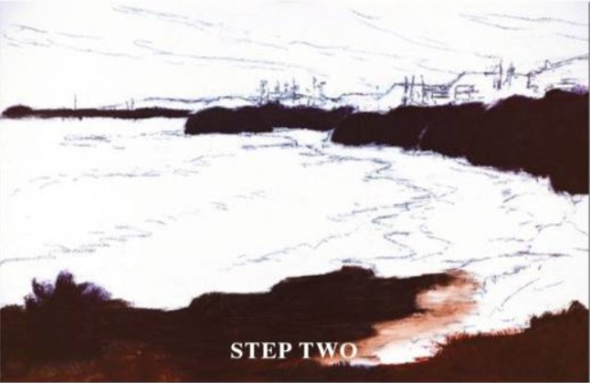
To establish the main ‘masses’ I used Ultramarine Blue and Permanent Crimson with a tip of Burnt Sienna to make a ‘dark’ which I diluted with gum turps to stain the dominant areas. This layer was applied thinly and evenly.
STEP THREE
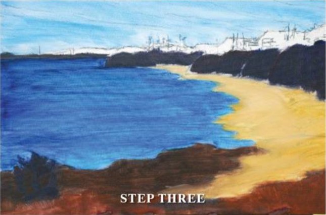
I established the sky area. Once again, a thin wash of Cerulean Blue and gum turps. I added Ultramarine Blue to this wash and stained the sea area – making it darker in the distance. The sand areas were then washed in using tints of Yellow Ochre, Raw Sienna and Titanium White. Also, to achieve tonal recession of the receding land masses, some of the yellow mix was added to the dark mix and painted over three distinct areas: Far distance (lightest tone), middle distance (mid tone), and nearest RHS hills (deeper tone). The rock shelf and cliff top were warmed by applying Light Red and Burnt Sienna to the wash.
STEP FOUR
Whilst the wind and sun were drying the previous underpainting, it was time to tackle the sky and the Illawarra escarpment. This was done using paint straight from the tube, or with very little medium The sky was painted using a mixture of Cerulean Blue and Titanium White. I mixed three ‘tints’ and painted from the top down – dark to light – then blended using a fan blender. At this stage, I suggested the clouds. I mixed Ultramarine Blue and Permanent Crimson and a tip of Cadmium Yellow to three separate batches of Titanium White to make three tones for the receding blue/grey/mauve of the near and far mountain ranges. This was applied, leaving a blurred edge between the sky and mountain tops.

STEP FIVE
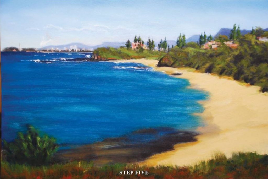
In the comfort of my studio, I was able to study the reference photographs and decide what to put in and what to leave out of the finished painting. I carefully placed the buildings, pine trees and other features using artistic discretion. After that, grasses and bushes were added on the hillsides, the central headland, and the foreground. I used various hues and tones of green made by mixing two basic blues and yellows.With the edge of a small palette knife, I carefully placed the two rock shelves at the base of each headland – using a brown mix of French Ultramarine Blue and Light Red. I added the three ‘sea’ colours to my palette and blended them with Liquin flow medium to give transparency and aid drying. I also added a small amount of white to the shallow areas. The sand was painted next, using thicker tints of Yellow Ochre for the dry sand, and Raw Sienna for the wet sand. Some white was added to the reefs by careful application with a palette knife and small brush – wiping off any contaminated paint after each stroke.
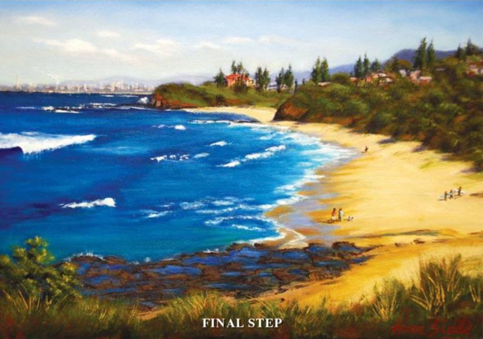
FINAL STEP
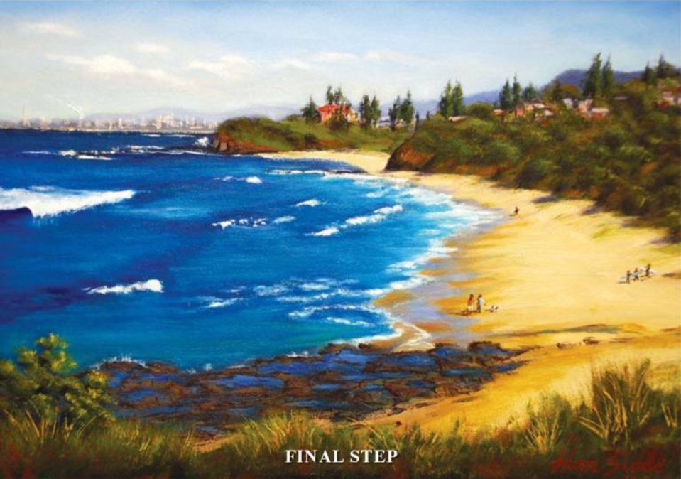
The most challenging part. The sea and sand areas were dry. I went on to paint the foreground rocks and rock pools. Using Liquin as a medium, I applied a Prussian Blue and Ultramarine Blue blend for the deeper water and swells; French Ultramarine Blue and Viridian.
MASTER HINTS AND TIPS
• It is important when adding figures that they don’t look as if they have been tacked on. Therefore, I place the shadows accurately; and I use three tones to give a three-dimensional effect.
• Practice your drawing skills.
• Learn the rules of good composition. Always have a focal point to make your picture tell a story.
• Don’t make the picture too busy.
• Try to achieve a full tonal range in your paintings.
• Paint the lightest lights against the darkest darks.
• Paint what you see …not what you know.
• Develop the power of lost and found edges.