
MATERIALS
• Full sheet of Mi-Teintes “Tex’in a light brown (or cinnamon) shade.
• White pastel pencil for the initial drawing Pastels for the cliffs: Winsor & Newton Raw Umber Tint 4, Burnt Umber Tint 3, Yellow Ochre Tint 1, Yellow Ochre Tint 4; no specific brand deep purple, light mauve, light grey and dark grey.
• Pastels for the ocean: Art Spectrum Phthalo Blue, Dark Phthalo Blue; Winsor & Newton Green Earth; Green Blue Shade Tint 1; Rembrandt Phthalo Blue; no specific brand light mauve (as for the cliffs).
• Pastels for the scrub: Gallery Dark Red Brown; no specific brand burnt
orange, and various shades of green.
• Schminke white pastel for highlights on the cliffs and ocean.
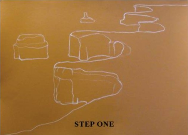
STEP ONE
I chose a fairly simple landscape for beginner pastelists, using a sheet of Mi-Teintes “Tex’ textured paper (sandpaper finish). As the actual shade of the paper plays a significant part in pastel work, I chose a cinnamon colour because that tone is fairly prominent in the foreground of the photograph. First up, I drew the outline of the cliffs using a white Conte pencil. I only ever use charcoal if there are a lot of darks in the painting and I know it will blend in.
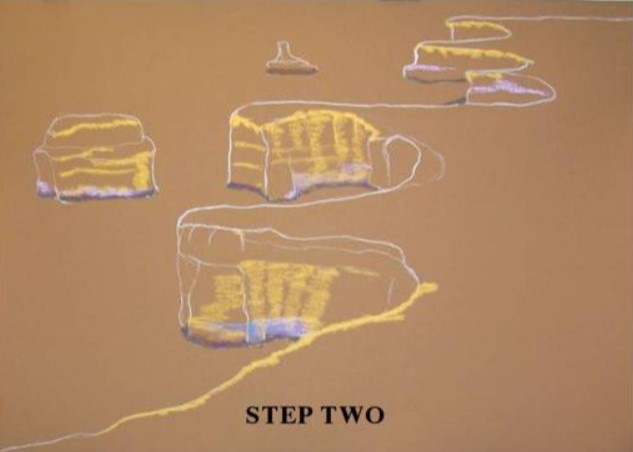
STEP TWO
I took the time to determine the shades I intended to use, to give this work the impact I always like to achieve. Sometimes I place a little of each colour on the work just to make sure I have no catastrophes.I applied the dark bases to the cliffs using Raw Umber and even a little purple. If I was using a dark coloured paper, I would have applied the lights first. I also started with the Raw Umber on the cliff surfaces.
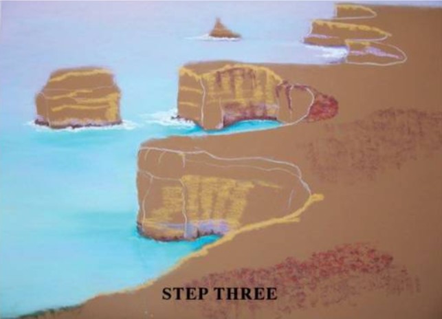
STEP THREE
I didn’t actually do a sky line – but chose to blend the colours upwards from the ocean to create a misty haze rather than a specific horizon. I chose to start with Deep Aqua blending into Green Earth, then Phthalo Blue with Dark Phthalo Blue at the base of the cliffs; then onward to a mauve and finally a pale lilac. I then used my fingers to blend the colours together. This is a contentious point as I know many pastellists who do not agree with the method … it is up to you to choose the ‘look’ you wish to achieve.I added some ocean breaking around the base of the cliffs; then I added Dark Red Brown to make a start on the scrub on the plains.
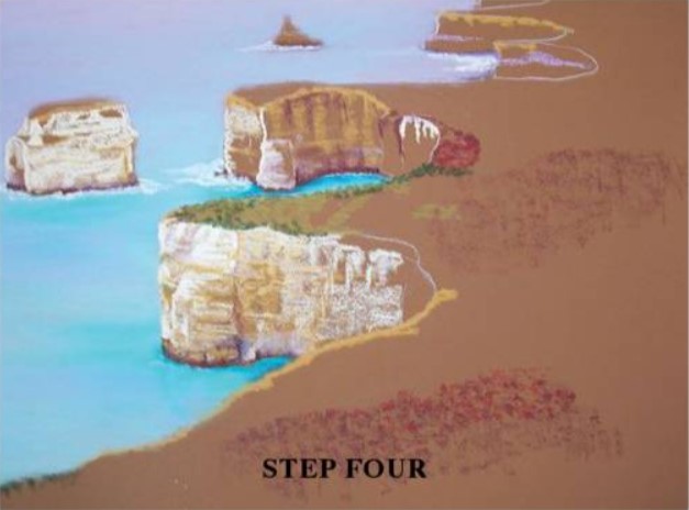
STEP FOUR
The advantage of using textured paper is that by placing the pastel on its side and lightly dragging it across the surface of the paper, I can easily achieve an uneven distribution of colour and the colour of the paper will show through – thus creating a typical rock surface. I did this using Yellow Ochre for the main colour, then randomly used lights and darks of the same shade here and there. Along the tops of the cliffs I used Dark Red Brown and gently ran it down in parts to define the top edge;and create shadows on the rocks … remembering that as the cliffs recede towards the background, there is never as much detail or strength of colour.
As I used lilac in the water, I added this to the cliff surfaces too. I think it is important to introduce the chosen colours all across a painting (getting them to form one complete work, not just bits and pieces).
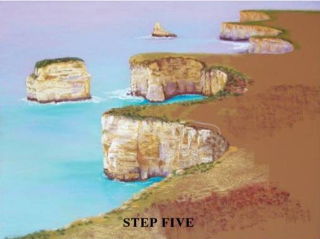
STEP FIVE
In the foreground, I defined the rock edges along the tops of the cliffs (rugged unkempt land without manicured edges). I started placing broken horizontal lines across the cliffs in various shades – dark red, and light and dark greys. As the photograph I was working from was an aerial view, the bushes were more like dots rather than leafy shrubs and therefore I started adding the various shades of green together with the Dark Red Brown, with a lighter burnt orange shade for highlights.
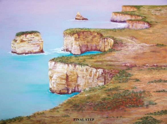
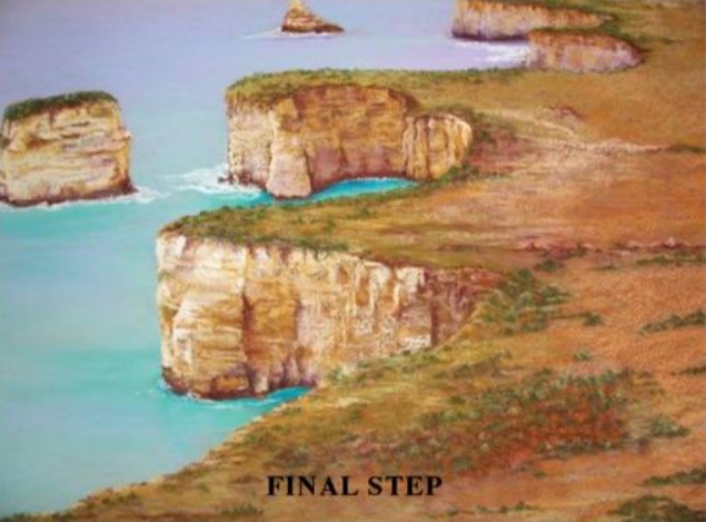
FINAL STEP
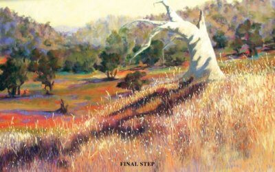
I added highlights of white on the breaking ocean and also on the cliffs (where they would be getting the most sun).
Finishing can take quite a while – paying attention to details and highlights but it is important never to rush the final step as it is what you will be presenting to the viewers in the hope that they will enjoy your work.
ARTIST’S HINTS AND TIPS
• By placing newspaper behind your art paper and making definite creases in it, when you apply your pastel to the art paper, the creases from behind will give your work definite ridges – which can be very effective if you are trying to create an interesting background.
• If you happen to make a mistake, use a kneadable rubber and never actually try to rub your colour off; use more of a ‘lifting’ motion by placing the rubber on the colour, applying pressure (a slight downward motion) and then lifting, Clean the rubber and repeat.
• It is most important to continually stand back from your work to view your progress. Acquire a dark piece of glass, preferably black; stand with your back to your work, and hold the glass so that it is above your shoulder and it reflects your work. If everything looks the same level of depth, then you have not made your contrasts heavy enough – and you should go back and work on your shadows. This is a marvellous way to give your work impact.
• I choose around 4.00 pm in the afternoons to go walking and take my photographs, because the shadows can be wonderful at that time of the day.
• The Australian Outback is a never-ending source of reference material with its magnificent colours. One way to capture the vastness is to have huge skies in your work and minimum fuss in the foreground … the essence being ‘space’. And often, less is more.
• Once I have completed a painting I always hang it in a prominent place so I can view it from time to time before having it framed. It is amazing how many times I have picked up errors which I did not see originally.