
MATERIALS
• Canson 220gsm white A2 paper
• 2H graphite pencil
• Eraser
• Indenting tools, variety of sizes
• Sharpener
• Camel hairbrush
• Solvent
• Small paintbrush
• Fixative
• Faber-Castell Polychromos pencils (oil based)
– Ivory – Raw Umber – Brown Ochre – Burnt Ochre – Burnt Umber – Burnt Siena – Warm Grey III – Warm Grey IV – Bistre – Olive Green – Walnut Brown – Dark Sepia -Nought – Terracotta – Orange Glaze
• Prismacolor Premier pencils (wax based) – Light Umber – Rouge Toscan – French Grey -Terre de Sienne – Beige – Warm Grey 50% – Warm Grey 20% – Sepia -Zeste De Lime
• Caran d’Ache Luminance pencils (wax based) – Orange – Brown Ochre – French Grey – Raw Umber – Burnt Sienna – Moss Green
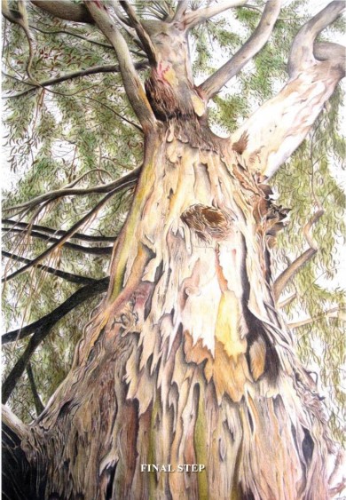
Every year my family spends time at Halls Gap, which is located in the magnificent Grampians National Park, Victoria, and this is where I took the reference photograph I’m using for this demonstration. At the time, I was meandering alongside a massive line of trees which were the end of the grassed area and beginning of the bush. I could see civilisation behind me yet my eyes where focused on these majestic trees which towered above me. I could close my eyes, smell the eucalypt, reach out and touch the rough bark. I took many photographs but I chose this one particularly for the brilliant textures of the bark.
STEP ONE
Using a large steel ruler, draw a grid with the 21 graphite pencil on both photocopied reference and your working surface. Always number the squares so you don’t lose track of your position. Very lightly sketch as many details as you want for your under drawing, although this must be very light. The graphite pencil will be erased as the colour pencil is laid down, and heavy sketching will make this difficult, leaving indentations on the paper. But at the same time, make sure your under drawing is not so light that you cannot see it!
STEP TWO
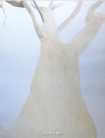
Following the direction of branches and with a light consistent circular motion, lay down the under colour of the bark using Polychromos Ebony and Brown Ochre. Go over the entire tree and largest branches, but don’t worry if this is not even as this will add more texture in the bark later. Now, using solvent with an almost dry brush, blend the colours. If the solvent is slightly streaky, this actually helps create a rougher bark affect. Many of the smaller branches are partly covered with leaves, so those can be left alone until after those leaves have been drawn.
STEP THREE
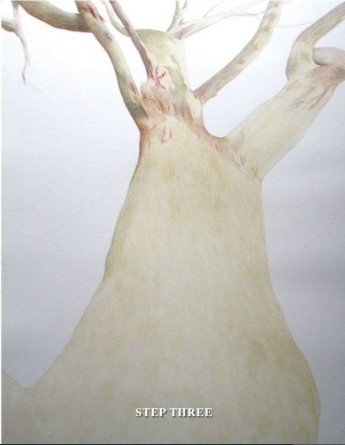
Now comes the fun part and time for personal preference with creating your ultimate craggy old gum. Personally, I use a huge range of colours and add layer after layer but you may use only a few. Gum trees have a the wonderful ability to fill in’ and blend the colours. I always use the wax based Caran d’Ache last to add rich fabulous colour in certain areas and really bring the tree to life
STEP FOUR
Use the indenting tool to create small or large hollows in the paper, creating fantastic textures on the bark. These can be applied both very gently with a smaller indenting tool or with a heavy hand and larger tool. Use the black pencils combined with the browns and greens to add depth. The blacks are never truly pure black but a mix of colours. For your gum tree, this again will be a personal choice, so experimentation is the key to understanding which colours you want to combine and where.


STEP FIVE
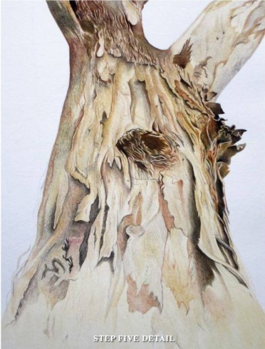
I have a heavy hand with my application of colours on the surface of the paper, but always work from light to dark. Begin with gentle strokes with a light colour, and when confident, increase the pressure. As you continue, constantly check on the direction of the light source and add shadow to create depth and realism. Large paintings full of details can be overwhelming, so focus on small sections at a time. Don’t think on the subject itself, but focus on individual shapes and patterns. The patterns and textures on a gum tree are random and that opens up an incredible opportunity for individual creativity!
STEP SIX
Remember as you come to the finish of the main part of the tree to get up and check from a distance. Turn it upside down and view it in a mirror. When you first think you have completed one section, there is almost always room for improvement. Again, with a landscape you have much more freedom for the colours to be more malleable. You can either keep the tones quieter and truer to the reference or liven and brighten up any dull colours. When you are content with your tree, merge the colours together even more with the use of a blender, but be aware that adding more layers after using a blender is very difficult. Solvent can also be used to mingle colours, but it can also lift a little bit of colour off your surface. Although, unlike the blender, many more layers can be added after applying solvent. You are also able to make details crisp and sharp again.

STEP SEVEN
The foliage of a gum tree must be appreciated and studied carefully before it is tackled. It is sparse in some places and thick in others. The leaves themselves can be tiny, rounded and clumped together or long, thin and draped in weird angles. Variation is important. With the clumps of foliage, I also gently laid down greens to provide definition and then added individual leaves on top in various shades of greens, greys and browns. As with creating any new masterpiece, patience is the key.
FINAL STEP
Add smaller branches and twigs, remembering that they are different shapes, lengths and can grow in a multitude of weird and wacky looking angles. The tree itself was photographed on a clear, bright summer’s day and so with a white background it brings the tree forward and defines it. I want to keep the tree in the spotlight.
Check over the entire painting, make any final adjustments and spray with a fixative. It is always a relief to put down the pencils after completing a huge piece of artwork. You can stand back from your painting and see a craggy old gum tree come to life, and also step closer and value every line and stroke of the pencil. It is time to acknowledge your accomplishment and remember the joy and beauty in the everyday.

ARTIST’S HINTS AND TIPS
• I love subjects like landscapes because there is much more leniency with the realism. When you draw or paint a portrait there is little room for error with the proportions and personality because that person should be recognisable to those who you create it for, whether it be yourself or others. But with a landscape there is much more flexibility with the specific subjects, composition, shape, colour and characteristics.
• When choosing reference photographs, the more detail you can see the more you can draw
• Be aware of copyrighted images and always ask for permission
or take your own references!
• A black and white photocopy of your reference photograph will help for constantly checking your values
• Use a PC, iPad or tablet to zoom in on details on your reference photograph
• Use a camel hairbrush to sweep away dust from your drawing. Never use your hands or fingers or blow it away as you may end up with spit on it!
• Use a clean sheet of paper to rest your hand on. The oils on your fingers and hands will smudge your drawing
• Keep pencils sharp
• While you are drawing, turn it upside down, sideways and even look at your progress in a mirror. Force your mind to see the image. You will be surprised what difference it makes
•Take breaks often and view your work from a distance. It will refresh your mind and help you to see what adjustments are needed
•Remember where the source of light is and the direction it falls on your subject
•No two artworks will ever be the same, even when using the same reference material, so believe in your own individuality and ability
• Enjoy whatever stage you are at, because even the most gifted artists in the world were at the same place once too!