MATERIALS
• 60 x 40 cm sheet of Canson pastel board, colour 502, Havane Clair.
• Can of workable fixative.
• Derwent Blender (pencil).
• Bantex eraser.
• Ledah 333 electric pencil sharpener.
• Coloured pencils: Prismacolor French Grey 10, 20, 50, 70, 90; Cool Grey 10, 20, 30, 50, 70, 90; White; Orange; Mineral Orange; Cream; Sand; Jasmine; Yellow Ochre; Goldenrod; Ginger Root; Beige; Beige Sienna; Sandbar Brown; Burnt Ochre; Celadon Green; Cloud Blue. Verithin Black. Polychromos Warm Grey 1, 2, 3; Cold Grey 5, 6; Black.
STEP ONE
For this drawing I used a 40 x 30 cm piece of Canson pastel board (colour 502); and Havane Clair, Prismacolor, Verithin and Polychromos coloured pencils (these are my preferred pencils as they are of the highest quality and they blend together easily).
This drawing features rocks from the north-west coast of Tasmania. I worked from a series of photographs that I took, as well as rocks from my collection.
I used an eight-tiled grid pattern to block out the shapes of all the rocks, using a Polychromos Warm Grey 10% coloured pencil. This gave me a light line – one that I could see, but one that wasn’t too dominant and was easy to remove or shade over when adding colour.
I almost always use ochre coloured pastel board. After years of experimenting I found that the pencils I work with perform best on coloured backgrounds … due to the palette I often work with (earthy colours and greys).

STEP TWO
Now that I had drawn in the basic details, I added the individual marks that appeared on each rock. I wanted to keep all the colours ‘fresh’, so I laid them down first instead of laying them on top of each rock’s base colour. Overlaying colours was not necessary at this stage.

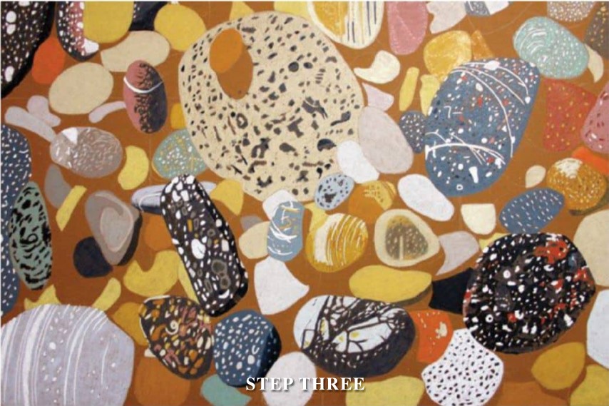
STEP THREE
Time to add the majority of the base colours. There were some rocks in the background, but I was more interested in the more obvious colours at this point. I wanted to get the overall ‘feel’ for the composition. Having so many objects to draw in a small space, one could easily get confused.
By clearly defining where the majority of objects were at this stage, the later task of adding the required detail was made a lot easier.
STEP FOUR
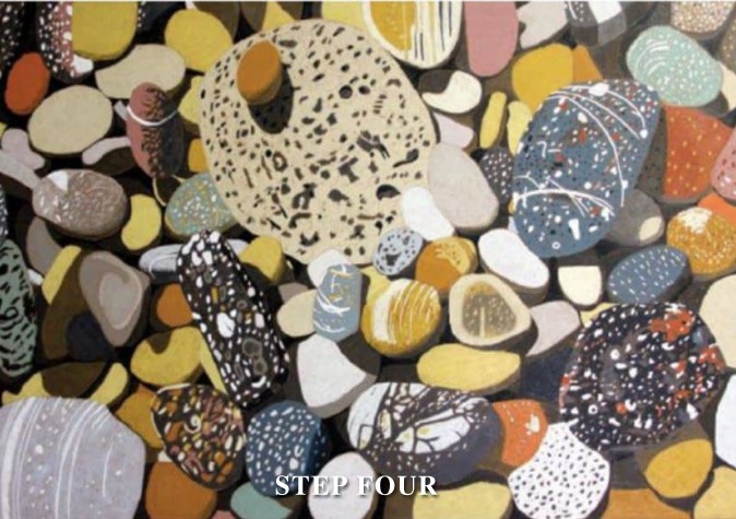
This was the time to add all the shadows that gave the drawing greater definition and gave a more three-dimensional feel to the composition. I try to avoid using black where possible, preferring deeper shades of greys and earthy tones for greater depth.
All the rocks had now been defined and had taken their place in the composition.
STEP FIVE
Time to add all the subtle details. This was where the use of line was very important. I paid particular attention to each rock, adding marks where necessary and ensuring that there was an even gradation of tone. Each rock is a three-dimensional object and needs to be seen that way.

FINAL STEP
All the hard work had been completed. Now it was ‘touch-up’ time. This was where I checked each rock and ensured that there was even colour, and I added any subtle textural marks that were missing or in need of strengthening.
I checked that all the shadows were in place and were correct in their respective tones. Light was very important, and I checked that I had given each of the rocks on the top layer their correct amount.
As with all two-dimensional art, drawing is an illusion. It’s important to make one’s drawing as believable as possible.
Attention to detail was vital for the whole artwork – not just for the obvious areas, but for the more subtle parts.
I wanted the ‘look’ of a group of rocks in the sun. Before I was finished I left the drawing on an easel for a few days to check for anything that I had missed, or any additions that I felt were needed.
Getting the right balance of light and shadow was the most important task at this stage. Once I was convinced that all was well with the drawing, I stopped.
After 18 hours of work, the drawing was ready to be framed!

ARTIST’S HINTS AND TIPS
• I always spray my drawings with workable fixative at the end of each day. This prevents ‘wax bloom’ occurring, where a light film can appear on the work. If this occurs, simply remove the film with a soft, clean cloth – then spray evenly with fixative.
• Pastel board is much easier to work with than paper because it doesn’t tear, dent or buckle; and it can be used without a drawing board. I sit my work on a drawing table without any attachments such as tape or clips.
• If you are using an eraser, use a soft one.
• Electric pencil sharpeners are by far the best way to keep your pencils sharp and avoid breakages.
• To avoid smudging, cover the areas of your drawing that you’re not working on with clean paper.
• Keep your pencils sharp and shade lightly, building up layers until you get the required density of colour.
• Colours can be “mixed by laying down different pencils over each other.
• Test your colours (before using them) on a piece of board or paper that is the colour of the one you’re using for your drawing.
• Tone charts are a good way of comparing colours before they are used.
• I prefer to work on dark coloured supports (paper/board), and all those I use have a slight texture (tooth). Smooth surfaces are fine to work on, but they lack the ‘look’ of textured surfaces.
• Work slowly and never rush your drawing. Concentrate on one area at a time.
• Don’t rely purely on photographs. Remember the copyright law! Drawing from three-dimensional objects is the best way to understand light and shade.
• What is your work trying to say? Get into the habit of writing an artist’s statement with your work – not after it’s finished; but before, during and after its creation.